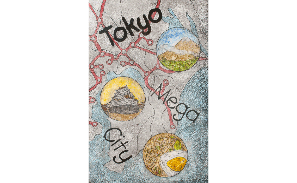
Tokyo Mega City Poster — Design Study — Detail
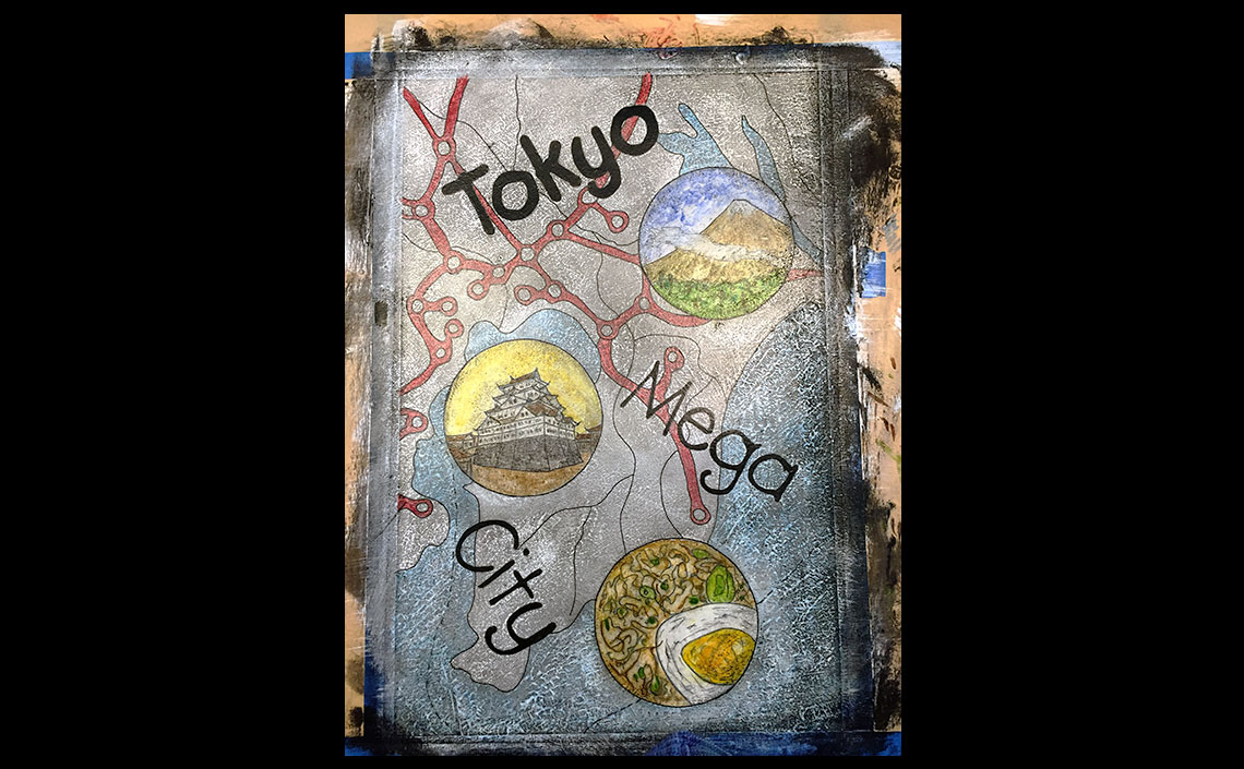
Top 1/3 of poster detail.
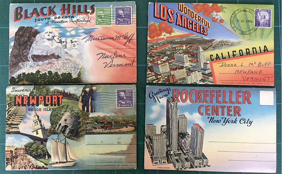
The design style of the three posters will be influenced by the subject matter: For example, technology—modern in design, historical—vintage in style. However, the general inspirational style of the posters will be based on vintage souvenir postcards from the 1940’s and 1950’s (slide 8).
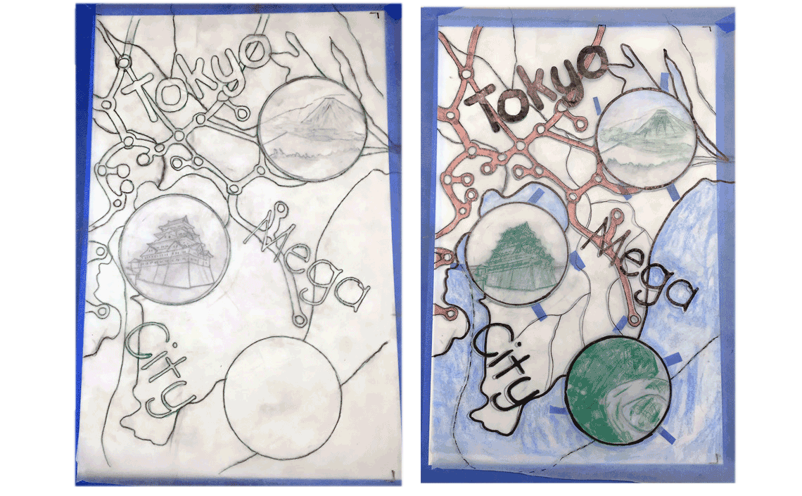
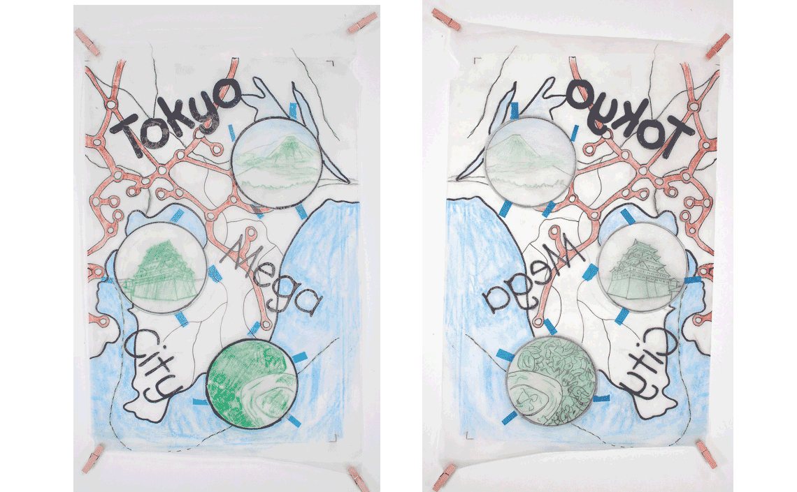
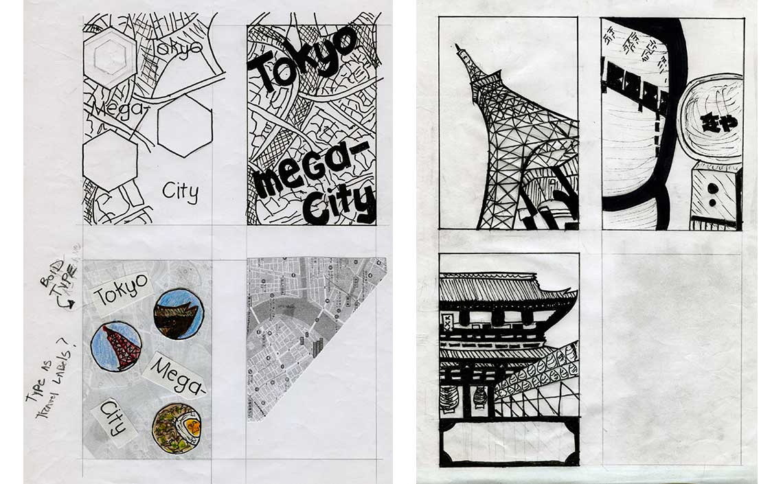
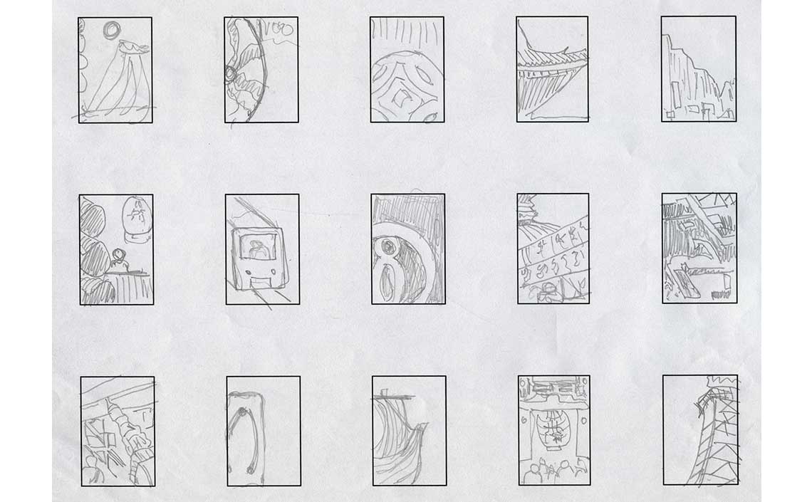
The poster was created using tracing paper layers (slide 7). A full-size tracing paper sketch along with the individually sketched components allowed for conceptual/composite compositional experimentation similar to using layers in computer software. This method was used to determine the placement of the circles within the transit map along with the typographical elements. The tracing paper sketch was also used to test the color palette. Rough conceptual sketches can be seen in slides 9-10.
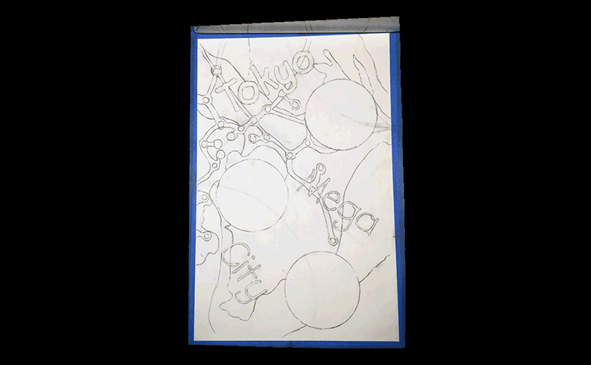
Next, the map sketch with circle outlines and typography was transferred. Then, the illustrations within the circles were sketched individually on separate pieces of tracing paper and layered under the full-sized sketch to try different order/compositional placement combinations. Once the location and position angle was determined, the circle layers were then taped to the main sketch. Then, the graphite outlines were transferred to the actual poster to act as the under drawing by rubbing and applying pressure to the sketch (slide 6, green pencil). The process was repeated for typographical elements.
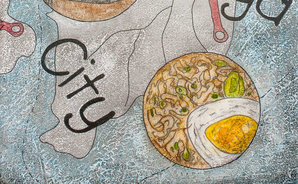
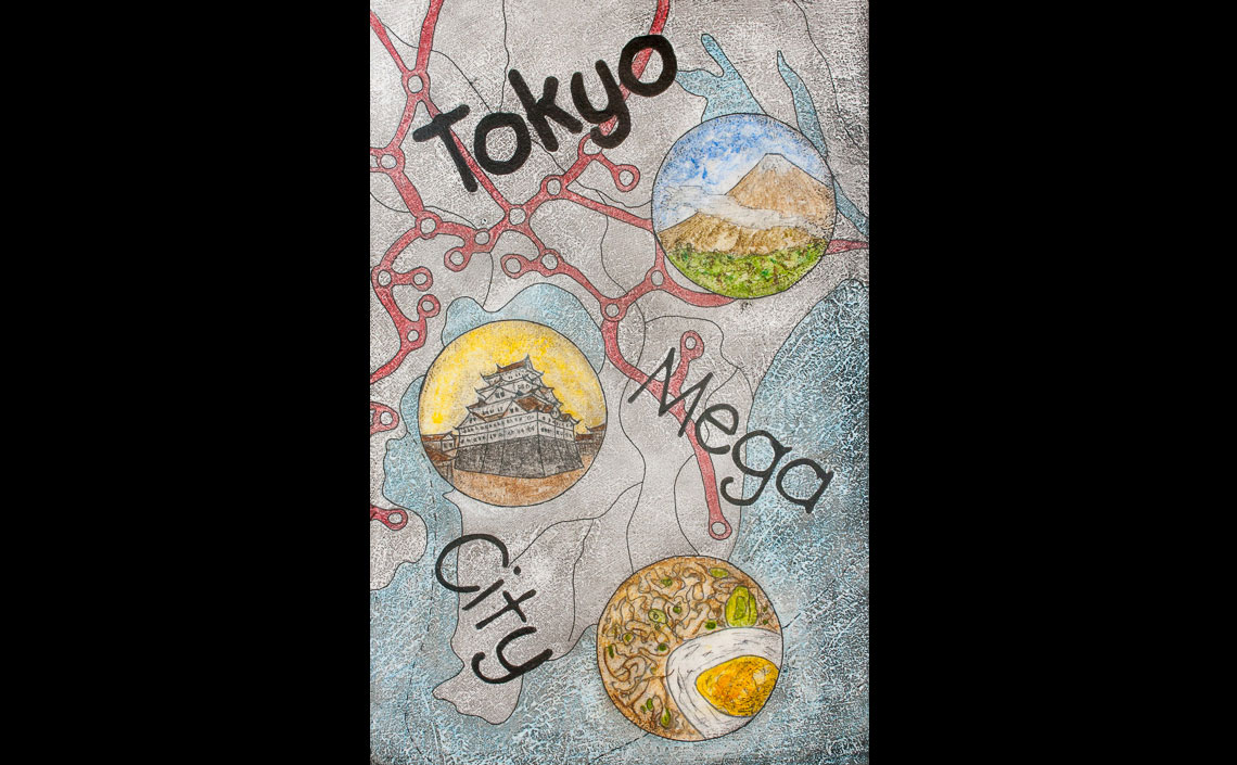
Once all compositional elements of the composite graphite sketch (slide 6) were transferred to the main piece and refined, a white pigment layer was added to all areas excluding the circles. Then, the entire under-drawing was hand-inked and sealed with acrylic matte medium. Next, areas of color were applied transit—map (red), water (blue), individual illustrations (watercolor)—then sealed with matte medium after each area was completed. With the last watercolor illustration completed and sealed, a final layer of acrylic matte medium was added to the entire piece. Next, black tempera paint was applied and manipulated to age and enhance the texture of the matte medium layers in the piece. The time-lapse animation (slide 5) shows the entire process in steps.
Matte medium was applied to seal each area to allow for greater experimentation, blending transparent textures with depth and layering of color within the piece. The matte medium created an "analog" undo if needed. The color layers could be wiped off and redone as well as built up in layers. The time-lapse animation (slide 5) shows the use of the matte medium layers throughout the creative process.
Railway Transit Map Reference Image Source: General Research Division, The New York Public Library. "General map of the Government Railways in Japan" The New York Public Library Digital Collections. 1910 - 1919. http://digitalcollections.nypl.org/items/510d47d9-8411-a3d9-e040-e00a18064a99
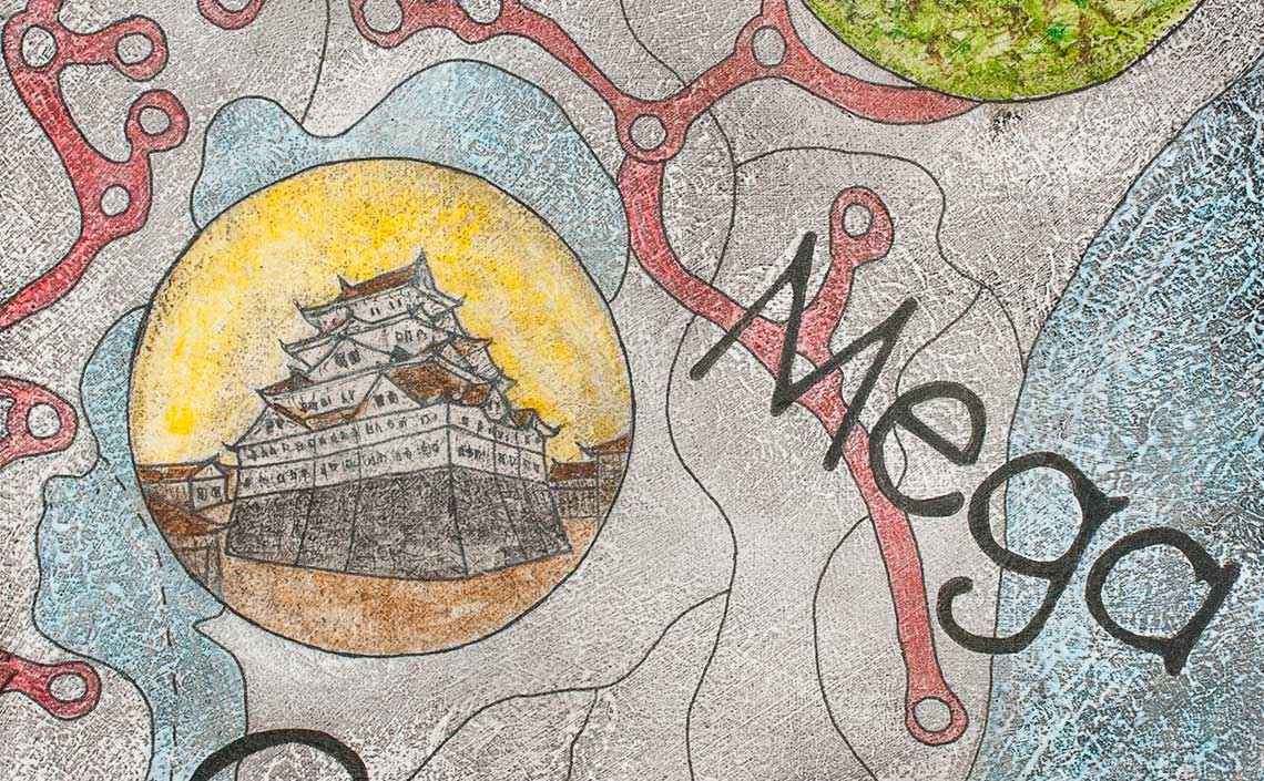
Castle Reference Image Source: The Miriam and Ira D. Wallach Division of Art, Prints and Photographs: Photography Collection, The New York Public Library. "Nagoya Castle" The New York Public Library Digital Collections. 1880 - 1890. http://digitalcollections.nypl.org/items/510d47d9-c94d-a3d9-e040-e00a18064a99
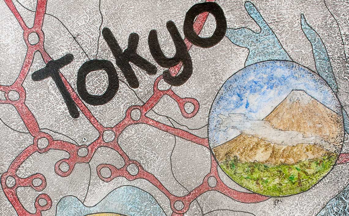
Mt. Fuji Reference Image Source: Rare Book Division, The New York Public Library. "DINNER [held by] NIPPON YUSEN KAISHA - S.S.ROSETTA MARU [at] EN ROUTE (SS)" The New York Public Library Digital Collections. 1901. http://digitalcollections.nypl.org/items/510d47db-6a39-a3d9-e040-e00a18064a99
1940’s and 1950’s Postcard Source: Personal Collection